Menu actions as data
Model reusable actions and permissions once, then render them anywhere.
· 6 min read
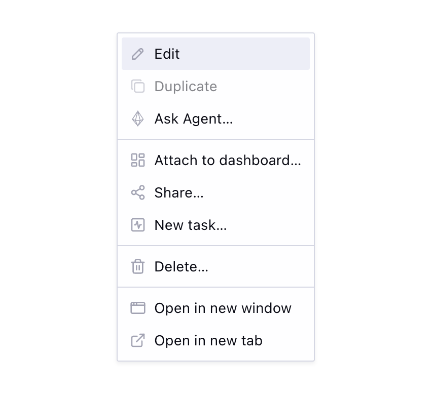
The usual entity menu is a component full of conditionals: {canDelete && <MenuItem onClick={handleDelete}>Delete…</MenuItem>}. It works for one entity. At twenty entities with shared actions — delete, share, edit, duplicate — the JSX gets copied and starts to diverge.
The deeper problem is coupling action definitions to render context. The same actions need to appear in multiple places: a listing-row dropdown, a card context menu, a detail-page overflow button. With JSX menus, you either duplicate the conditionals or extract a component that accepts every possible configuration as props.
Structuring the actions
The fix is decoupling the what from the how. Instead of treating menu actions as JSX, treat them as a data structure.
A hook owns the action logic and returns plain objects. An agnostic renderer consumes the action list.
The concrete example throughout is Memory — a stored unit of context in an AI agent product — but the pattern applies to any entity type.
const items = useMemoryMenu({ memory, context: 'listing' });

// ...somewhere in the render tree:
<EntityDropdownMenu items={items} trigger={trigger} />;
Each menu item describes an action or a visual separator, without knowing how it will be rendered:
type MenuItemAction = {
  label: string;
  icon: ElementType<IconProps>;
  action: string | (() => void);
  disabled?: boolean;
  tooltip?: string;
};

export const MENU_ITEM_SEPARATOR = { separator: true } as const;

type MenuItemSeparator = typeof MENU_ITEM_SEPARATOR;

type MenuItemFromCatalog<TCatalog extends Record<string, unknown>> =
  TCatalog[keyof TCatalog];

type EntityMenuItemCatalog = {
  action: MenuItemAction;
  separator: MenuItemSeparator;
};

type MenuItem = MenuItemFromCatalog<EntityMenuItemCatalog>;

function isMenuItemSeparator(item: unknown): item is MenuItemSeparator {
  return item === MENU_ITEM_SEPARATOR;
}
When action is a URL string, the renderer emits a native <a href> — real navigation semantics, keyboard support, and browser affordances like "Open in new tab." Callbacks stay for in-app actions that do not navigate.
Composing the action list
To build action lists ergonomically, you need a few primitives. useMemoryMenu() assembles its items using menuSection() and buildMenu().
menuSection() groups related actions and filters out falsy values, making conditional short-circuits clean:
export function useMemoryMenu({
  memory,
  context,
}: UseMemoryMenuProps): MenuItem[] {
  const { confirm: confirmDelete, isPending } = useConfirmAction({
    onConfirm: () => deleteMemory(memory.id),
  });
  const detailPageUrl = useMemoryDetailUrl(memory);

  return buildMenu(
    menuSection({
      label: 'Delete…',
      icon: DeleteIcon,
      action: confirmDelete,
      disabled: isPending,
    }),
    context === 'listing' &&
      menuSection(
        {
          label: 'Open in new window',
          icon: NewWindowIcon,
          action: () => navigateNewWindow(detailPageUrl),
        },
        {
          label: 'Open in new tab',
          icon: ExternalLinkIcon,
          action: () => navigateNewTab(detailPageUrl),
        },
      ),
  );
}
Behind the scenes, buildMenu() flattens the sections, drops the empty ones, and inserts separators between the rest:
export function buildMenu(
  ...sections: Array<MenuItem[] | false | null | undefined>
): MenuItem[] {
  const visibleSections = sections.filter(
    (section): section is MenuItem[] =>
      Array.isArray(section) && section.length > 0,
  );

  const menuItems: MenuItem[] = [];
  visibleSections.forEach((section, index) => {
    if (index > 0) {
      menuItems.push(MENU_ITEM_SEPARATOR);
    }
    menuItems.push(...section);
  });

  return menuItems;
}

export function menuSection(
  ...items: Array<MenuItem | false | null | undefined>
): MenuItem[] {
  return items.filter((item): item is MenuItem => Boolean(item));
}
Centralizing shared logic
Actions like delete, share, edit, and duplicate appear across many entity types. So do the permission rules behind them: who can see the action, who can use it, and what explanation they get when it is disabled.
Because menu actions are data, each action can carry its own permission result before it reaches the renderer. We can centralize the common actions and their access rules in a shared hook:
const entityMenuActions = useEntityMenuActions();

entityMenuActions.deleteMenuItem({
  confirm: confirmDelete,
  isPending,
  permission,
});
entityMenuActions.share(slug);
entityMenuActions.addToAskAgent(entity);
entityMenuActions.duplicate(entity);
Each factory returns a MenuItem or null. null hides actions the user cannot access. A disabled item with a tooltip handles actions they can see but cannot perform:
function deleteMenuItem({
  confirm,
  isPending,
  permission,
}: DeleteMenuItemOptions): MenuItem | null {
  if (permission?.result === 'hidden') {
    return null;
  }

  return {
    label: 'Delete…',
    icon: DeleteIcon,
    action: confirm,
    disabled: isPending || permission?.result === 'disabled',
    tooltip: permission?.reason,
  };
}
The rule for showing, disabling, and explaining an action lives exactly once. JSX no longer carries permission logic, and each render surface gets the same access behavior for free.
Agnostic renderers
Because the action complexity is handled by the hook, the rendering layer becomes trivial. <EntityMenuItems> loops the array and maps each item to the right primitive — separators become menu dividers, string actions become native links, and callbacks become menu buttons. <EntityDropdownMenu> and <EntityContextMenu> are thin shells that pass the same items to different menu primitives.
function EntityMenuItems({ items }: EntityMenuItemsProps) {
  return items.map((item, index) => {
    if (isMenuItemSeparator(item)) {
      return <DropdownMenuSeparator key={index} />;
    }

    if (typeof item.action === 'string') {
      return (
        <DropdownMenuItem key={item.label} render={<a href={item.action} />} />
      );
    }

    return <DropdownMenuItem key={item.label} onClick={item.action} />;
  });
}
type EntityDropdownMenuProps = {
items: MenuItem[];
trigger: ReactElement;
dropdownMenuContentProps?: ComponentProps<typeof DropdownMenuContent>;
};
export function EntityDropdownMenu({
items,
trigger,
dropdownMenuContentProps,
}: EntityDropdownMenuProps) {
return (
<DropdownMenu>
<DropdownMenuTrigger render={trigger} />
<DropdownMenuContent {...dropdownMenuContentProps}>
<TooltipProvider>
<EntityDropdownMenuItems items={items} />
</TooltipProvider>
</DropdownMenuContent>
</DropdownMenu>
);
}Both consume the exact same array:
// listing row
<EntityDropdownMenu items={useMemoryMenu({ memory, context: "listing" })} />

// card right-click
<EntityContextMenu items={useMemoryMenu({ memory, context: "listing" })}>
  <MemoryCard memory={memory} />
</EntityContextMenu>

// detail page header
<EntityDropdownMenu items={useMemoryMenu({ memory, context: "detail" })} />
The context prop dictates which sections the hook includes. The renderer just loops and renders. It can be a dropdown, a context menu, or even a command palette search source.
The payoffs
By modeling menu actions as data, you get massive leverage:
- New menus are fast. Write a hook, assemble sections, use shared actions. The renderer already exists.
- Global actions are trivial. Add an action to
useEntityMenuActions()and every entity menu in the app inherits it. - Permissions stay consistent. Visibility, disabled states, and tooltips are decided before rendering, so dropdowns, context menus, and command palettes do not drift.
- Logic is testable. Unit test
useMemoryMenu()by asserting on the returned array. No rendering, no simulated clicks, just verifying items against props and permissions.
The throughline
This is the same principle as the dialog stack and the shortcut catalog (post coming soon). A small typed platform pays off as the surface area grows.
Action menus scale by returning one more item. Dialogs scale by registering one more component. Shortcuts scale by adding one catalog entry. Call sites stay small because the complexity lives in the right place: the data layer.